
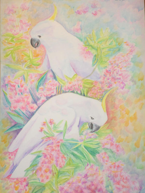
I've worked a little more on the background to make the Cockatoos stand out. I'm still not entirely happy with it, but its more vivid at least. I may work on it some more, but will probably leave a little more time between updates.
And hopefully I'll have made some new pictures in the meantime!
I've been wondering when the cockatoos were going to surface again ;-)
ReplyDeleteI like it...they really stand out now and the background is still soft enough not to dominate.
Now I'm feeling guilty that I haven't drawn any thing more. Cooler autumn weather means more work outside and less time inside, I'm afraid.
Thanks. :)
ReplyDeleteDon't feel bad, I know what you mean about the cooler weather. We spend a lot more time out there when the sun isn't cooking us either!
Its beautiful Chris. I agree that the background makes the birds pop. I think that you could do more to create depth in the background and still not allow it to dominate as it would enhance the birds. This is trully lovely.
ReplyDeleteThanks Linda. I've been contemplating darkening areas in the background, but where would you suggest? Do you mean around the lower half of the bottom bird? I'm afraid of darkening around the top bird, in case it doesn't look like its behind the other one.
ReplyDeleteWell, lets see…..
ReplyDeleteIf you were to provide more detail to the foreground (bottom) then it would come forward more. For the top bird, think about cast shadows-actually for some of the front too. How realistic do you want this? I once had a print of parrots that was a riiot of color and it had a lot of depth to it-it was a jungle scene-and it had lots of bold contrasts to it throughout. But I understand how you are feeling-its so pretty as it is so going slowly is a good idea.
I say work on the very botton then work on what is behind the bottom bird-move around the paper alot. And think about adding to the birds forms through shading-just what you have done but a little bit more-colors and values are perfect so far-just more of it in different areas. It may be there-I think I see some but its very sublte and I can't be sure if its my eyes or not. Whatever you do, go very slowly-work and walk away for 10 minutes and then evaluate before doing more.
I agree the top bird needs more anchorage with shadows. I guess I am going for realistic at this stage, but if I'm unable to achieve that, I'll go more abstract. It's a combination of both at the moment. I don't think its going to be completely realistic. That's what I like about watercolour, its something you can experiment with and not be super realistic to pass as realistic.
DeleteGoing slowly is my approach with this one, because it has so many elements which interact with each other. I could easily use conflicting elements in different sections, and that's incredibly frustrating, lol. I've already experienced that in this picture, and its because I didn't go heavy that I was able to turn it around.
I'm not comparing myself to them, but I can understand now why masters would take years to finish an oil painting. That medium takes ages to dry and if you muff it up, you have to start all over again!
I forgot to say, thanks for your feedback. :)
Delete