
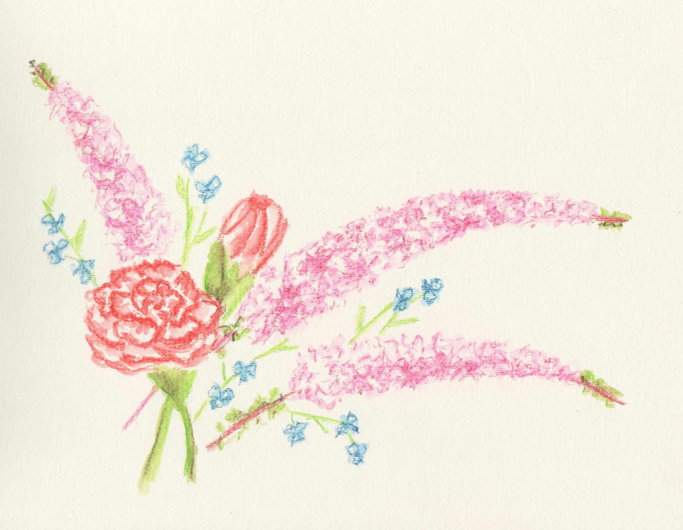
Intense pencils to be precise. I'm not sure what the long sprays of pink flowers are, but I do know the rest are red-tipped carnations and some blue wandering jew from our garden. I added them in to get a nice contrast in flower size and colour.
I liked it, but then I also thought it was a little boring too. After reading this article (its really good) about painting flowers, I decided to tackle the negative space in the background. And here's what happened...
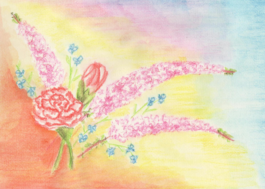
I ruined it. Inktense pencils are great for fine detailed work, but terrible for large areas. It dries really quickly, and by the time you get your brush loaded with water again (I used my new water brush) it starts to dry and you can't blend it back together, like you can with watercolour pencils. So the background looked splotchy.
I decided to tackle the picture again. It was going to be a reminder of our wedding anniversary, after all. This time however, I was going to stick with the Inktense pencils for the detailed work, and tinker with the flower arrangement (per the article) to make better use of the negative spaces in the background.
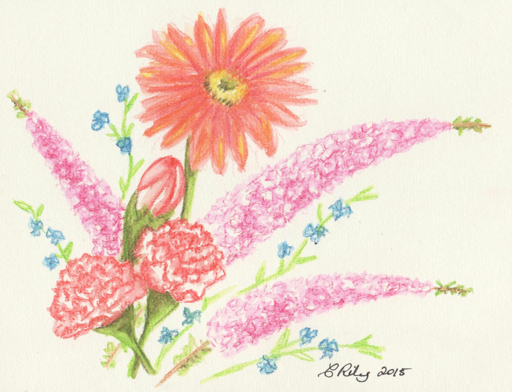
I added an extra carnation (the magic of threes) and held my breathe while adding the big gerbera daisy, last. The daisy was in the bouquet my husband gave me, but they were red (like the red-tipped carnations) and I didn't want to drown the picture in reds. I liked the tangerine in the background I used before , so added it to the gerbra instead.
I think the lone daisy complements the arrangement nicely. By keeping it simple and working on the flower arrangement, I doesn't need a fancy background.
This is also another contribution to the February challenge.
PS: which arrangement do you like the most?
Nice work! You captured the structures of the flowers and I love the frothy longer ones especially. I used to collect ephemera and your composition is very reminiscent of Victorian/ Edwardian greeting cards which I love! Definitely best on a whit ground. The daisy pulled it together in the end. And Happy Anniversary! Many more! I am going to read your link....awake at 3 am here with a soar throat! Blah!
ReplyDeleteThanks. :) I thought it did have a particular cottage look to it, because the flowers were from a cottage garden. I thought ephemera too, but its way too small. I had to go looking for it online, and it might be a Geraldton Wax Flower (Australian native).
ReplyDeleteI agree, the white background works best. I hope you enjoyed reading the link and that your throat gets better soon! :)
The long pink sprays look like Buddleia (Butterfly Bush) I've got it flowering at the moment.
ReplyDeleteI agree you ruined it with the background :-( but I have to say I don't like the gerbera at least not where it is. It dominates too much. I would have preferred to see it slightly behind the carnation bud, partially hidden by it, so it's not sitting up so high.
I certainly made it look like Buddleia, lol, but it is the Australian wax flower. I went for a loose application so it was easier. :)
ReplyDeleteI can see what you're saying about the daisy. It does command the attention and makes some of the other flowers lose their subtle delicacy. I'm hoping to try other experiments out to see if I can improve on it. If only I could get it the first time, lol. ;)