
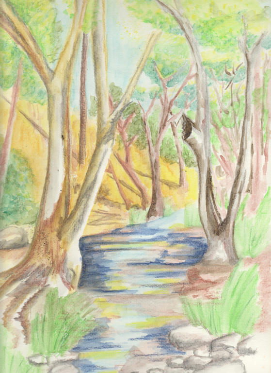
Too much dark blue was added to the water. It was meant as a (small) contrast to the water, instead it changed the water colour completely. Use less darks next time, and build them up gradually. Some of that dark blue in the water, was meant to be the shadows of some of the trees - so I might be able to add greater contrast, by adding a darker brown (selectively) for the tree shadows.
I've also used too much brown in the landscape, with not enough variation between the closest trees and those furthest away. The closest trees should be the darkest, with the most shadow, but those in the distance seem to have more of that quality.
So in my attempt to add more detail, I just added more darker colours over the lighter ones, with the same lack of variation I had before. Frustrating, but still a learning process for next time.
Is there anything others would like to highlight, which needs addressing too?
UPDATED to add a link, demonstrating how to achieve atmospheric perspective.
I don't think you are doing anything wrong on this. Painting is a process and it will go through dissatisfying stages before it is finished. You can lift off the colors you feel are too dark such as the blues.
ReplyDeleteMy questions: where is your light source coming from. I am assuming this is your property? So what colors do you see in the trees that you are painting? I think that observation will give you the variety you are seeking. Show your lightsource on the greenery and the water ( I know its coming from the right hand side).
Thanks for the feedback. I tried lifting some of the colours and while they got a little lighter, they were still very much fixed. Are you supposed to leave the water on there a while. I put the water on and leave for 10 seconds, then lift with a paper towel.
DeleteThe picture isn't from my property but an old book - I would love to have a brook like that on my property though! There aren't a lot of colour differences between the two property's, its all straw coloured, browns and dull greens. I am experimenting with the picture further though. Its looking a "little" better, but it really needs to have some colours removed and that's not happening.
No, you actually take a stiffer brush (some specify a chisel brush) and you wet it and you brush off the color you want to ligten. It works on most colors but some pigments have heavier dyes so you will only get so much. Once you lift, leave it alone and let it dry or you will start to mess up the paper. It sounds like you let it dry then tried to do what people do to a wet surface? Your method would work for that I think.
DeleteWell, if that brook is deeper then the blues will make sense-deepr water is darker. I think though that you are comparing it to the rest of the picture. Dark is only dark if there is something light near it and vice versa. Does that make sense? So if you continue to work on the other aspects and ignore the creek for now maybe it will blend in over time.
I'd work on the colors-the greens you mention for example-the dull greens. How dull? Cool? Warm? Remember that warm comes forward and cool recedes so that is important too. You are working on wonderful piece and I hope you stick to it.
I forgot to answer this one too, probably because I was busy trying to use all the advice in my improvements. They all helped by the way, so thanks for sharing. :)
DeleteIf it were not for the rocks and the reeds in the foreground, I'm not sure I would 'see' the blue as water. I agree it's too dark, esp in the background.
ReplyDeleteI just ordered a set of those water brushes. I'm looking at building up a stock of materials for the day when I actually have enough time to use them! Finding your experiences and the links you give very useful.
I agree with the blue critique - especially up the back where it should be lighter. Thanks for the feedback.
ReplyDeleteI hope the brushes help with your creative process. I like not having to worry about tipping a pot of water over my paper, especially with a toddler around who likes to pull things off the benches, lol. I wouldn't buy everything Derwent has to offer, but what I have found I've needed, has been worth the investment. :)