
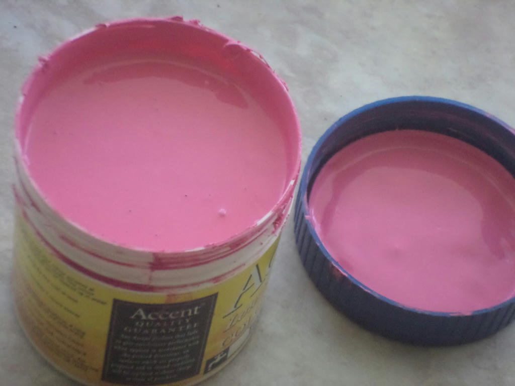
But I'm getting ahead of myself. First to where my inspiration came from - a sample pot of hot-pink paint. I found it while sorting through my supplies and wondered, how on earth could I possibly use this in a piece? The first thing which popped into my head however, was a Chanel hot-pink and black dress.
This was not typical of the fashion period I was drawing, but I didn't see any problem mashing things up, so long as the feel of the piece remained in-tact. Then it came to finding myself a suitable model.
Oh boy...
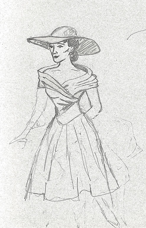
Edited using GIMP, to make pencil stand-out
This was going to come exclusively out of my head, as I didn't want to duplicate someone else's photography. Only problem was, it came out so flat and lac lustre, I didn't even finish the piece before deciding she wasn't going to be my model. Notice all those finicky details? I should have focused on her pose instead.
Then I read Jasmine's tutorial, and WHAM! What came out on paper next, suddenly had a more natural form.
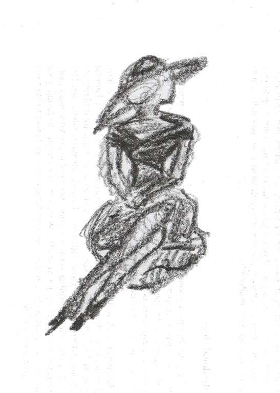
Edited using GIMP, to make crayon stand-out
Using my son's crayon was better for this type of sketching, rather than regular HB pencil. It just gave more body and filled in quicker. So when I was happy with the pose, it was on to complete the details of the fashion itself.
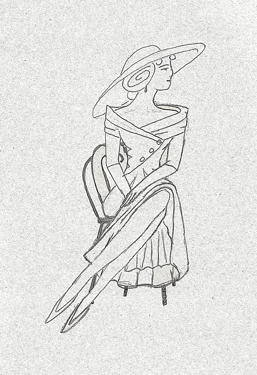
Edited using GIMP, to make pencil stand-out
I modelled the dress more off a Christian Dior dress, than a Chanel one, and even then its not exactly the same. I guess you could say, they're a combination of the two designs. Then I gave her a chair, probably a little French Parisian in style, to sit on.
I'm guessing this lady is outside, although she could be waiting at a cafe too. I didn't want to get too lost in background details, because it was all about her pose and style.
Then came that lovely hot-pink!
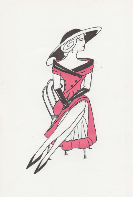
The mediums used are the acrylic paint, permanent black pen and white paper. Although it looks rather simple, the work involved getting it out of my head was incredibly complicated. But its nice to have a piece I can say is completely my own.
I did a little research on dresses and hats from the 50's, but even then, only took bits and pieces, of what I thought would work here. I even deliberately didn't give her a necklace, as it made the head and shoulders look too busy. A teardrop earring is all she has as jewellery. The hat and dress though - well that's the focal point!
If I go a little further, this piece is probably about sophistication too - of a time when women's fashion seemed to be more about intelligence and not just beauty. Men had always worn suits to look sophisticated, but women had frilly and effeminate attire only. This particular era of fashion (between the 20's and 50's) allowed women to dress more smart like a man, but without hiding their femininity either.
But it all began for me, with a sample of hot-pink paint! What would that colour inspire you to create?
Pink is my favorite color. Nearly all of my dresses, tops and sweaters in my wardrobe are pink and so is my bed frame! That color pink you asked us about? I'd paint something in my house that color. I'm not even kidding! lol.
ReplyDeleteI love your final work! Its a lovely form and composition. I adore that her slip is showing and that she is in sillhoute (sp?). Everything is perfect and you had better not be picking at this saying that anything is wrong because there is nothing to pick at! lol.
I can see how the technique Jasmine taught you did make a difference to your work.
You said that you feared copyright if you drew from a photograph. I think that if you credit the photographer you are okay with that but you can also find some places online that provide figures to draw as well as books are available. I'm not sure how fashion illustrators are allowed to go to fashion shows and sketch work-there must be some kind of an agreement there so its worth looking into. There are ways around it.
I also love vintage clothing-not so much the 20's though I do love art and design from then-I'm more a 30's-50's person. Another like your drawing here (as a set) would be amazing.
I didn't know pink was your favourite colour. Mine is green, so on the colour wheel, we harmonise well, lol. I was actually on my way to bed last night, when I quickly saw your suggestion to make a set. If I wasn't so tired, I would have replied: "I accept your challenge." ;)
DeleteThe contour sketches makes SUCH a difference and I'm glad Jasmine shared this technique. It's easy to draw poses now, when I would struggle formerly.
I agree, some of the dresses from the 1920's look like glorified potato sacks too, lol, but the really glamourous, silk-like dresses look sublime. Again, this isn't something "I" would normally wear, but its classic vintage so I can appreciate it for what it was. :)
The 30's to the 50's, had better clothes for all women to wear I think. The 50's in particular looked really exciting - but then they had Marilyn Monroe and Elvis Presley too, which Andy Warhol, didn't fail to miss. ;)
Very cool, I agree about this looking great as a set, in black oval frames in a powder room or something like that since it's very lady like. She puts my posture to shame! I'm glad you used the crayon, did you feel a difference in the way you could render the form?
ReplyDeleteAlso, this is a really great example of how line work and simple shapes can create depth (the size, shape and black of the hat suggest that it recedes, and the "stacked" effect of her hairstyle gives her face form without needing to use shading).
Definitely, the crayon was chunky like the drawing I was trying to fill - I would have to render twice as many pencil strokes with a HB pencil to get the same effect. But I have a graphite block somewhere too, which I'm sure would make a good substitute for my son's crayon's. I managed to save one crayon from his taste- testing frenzy. Thank goodness, they're non-toxic!
DeleteI had fun with the pen work, many of the things you pointed out, happened when I was rendering - which is always fun when a piece speaks to me. Thanks for the tips on contours, as it really made this piece come to life in the first place. :)