
This caused a small dilemma however, as she was in a seated position, and that would limit me to another seated pose. If this were to be a set, I would need similar proportions on the two separate pages. Keeping this in mind, I proceeded with an idea which would not be a seated pose...because I like a challenge.
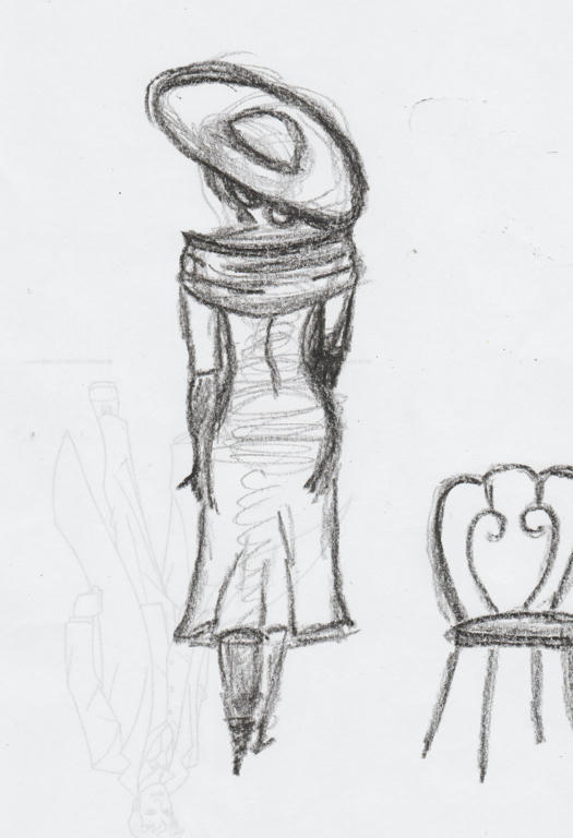
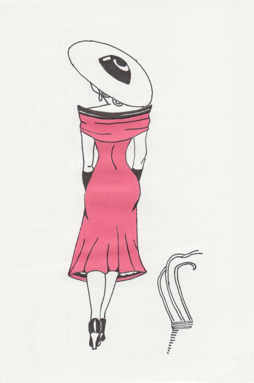
I wanted an image of her walking away from the chair, as calmly as she had sat upon it. So I started with a contour sketch first. I was mostly happy with the composition, but there were small details I fixed on the tracing paper, when I transferred the image to the clean paper, for rendering.
And then out came the hot-pink paint again...
I know there are some differences between the seated and standing figures, but to make their attire exactly the same, would've compromised each piece individually. Like I didn't want a white hat in the above pose, but if I were to colour it black (same as the other one) it would take emphasis away from the dress.
Backs of dresses are always less interesting than fronts anyway, and the lighter hat helped to create levity, as opposed to heaviness. Her skirt also looks less full in this image, as opposed to the seated one, but I wanted her curves to create interest in the dress also - and that couldn't be achieved with a much fuller skirt.
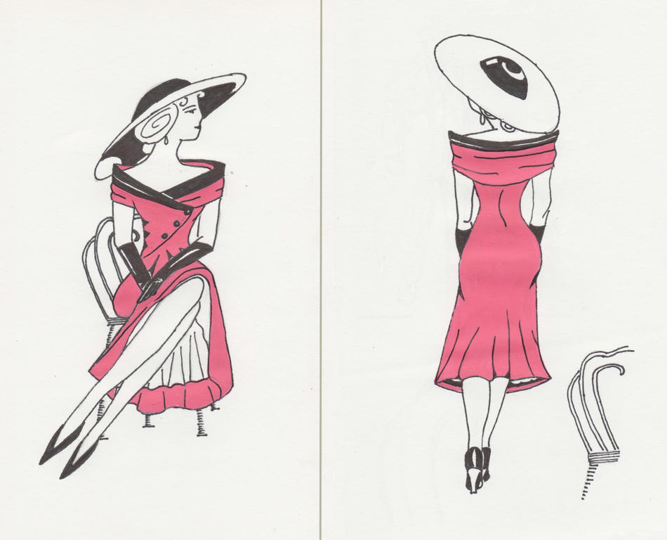
Side by side, for comparision
So they are similar, but not exactly the same. I kind of like that! Also, the standing position is only marginally taller than the seated one, so not letting the fear of proportions prevent me from trying something different, paid off.
Thanks to Linda and Jasmine for the suggestion to make a set. It was a fun challenge to attempt, and really made me think about form and composition. I know the images themselves don't look very complicated, but the thought in making them balanced (both individually and together) was rather involved.
In fact, if you notice the white hat looks a little smaller than the black one, they were done in proportion to how far their hem lines were cast - this added balance to each pose individually.
I also had them facing each other on purpose, to show interaction, even though they're meant to be the same model. If you wanted to show disassociation, you would swap the images around, so their backs would be facing each other instead.
I think it's fine that proportionately they are near the same height because they are not in the same picture. I like that she has her back to us, walking away but looking at her twin. It almost seems like the first one was listening for her name being called and then in the second one, she is responding:)
ReplyDeleteGreat job on these.
Thanks, it was fun! :) I like the thought they might be calling to one another.
ReplyDelete